Testing usability for a complex feature redesign
Research and user feedback revealed that the 'match and rank' feature in Torre was highly valued, but lacked visibility and wasn't easy to understand at first.
So I redesigned it, with a simpler, right-in-your-face interface to make decision-making easier and quicker for our two types of users. Talent seekers assessing applicants and job seekers evaluating potential jobs.
After working on several drafts, the usability test showed that the new 'match and rank' design fulfilled that goal for both types of users.
Company:
Torre.ai
Role:
Product Designer
Tools used:
Figma, UserBob, Notion, ChatGPT
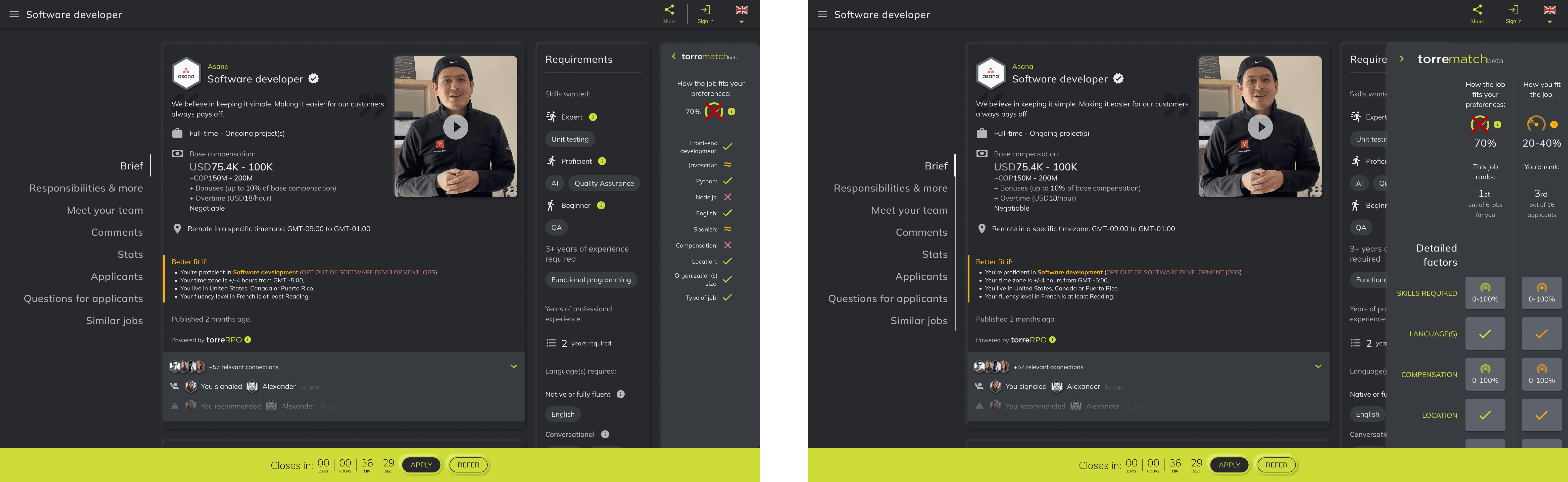
Torre's 'match and rank' feature
Torre’s 'match and rank' is a feature that shows the compatibility between a candidate and a job opening.
It uses AI and algorithms to help users decide if a candidate or a job is a good fit for them. That's why users see it as one of Torre's standout features compared to other platforms.
As seen below, the 'match and rank' has two types of interfaces:
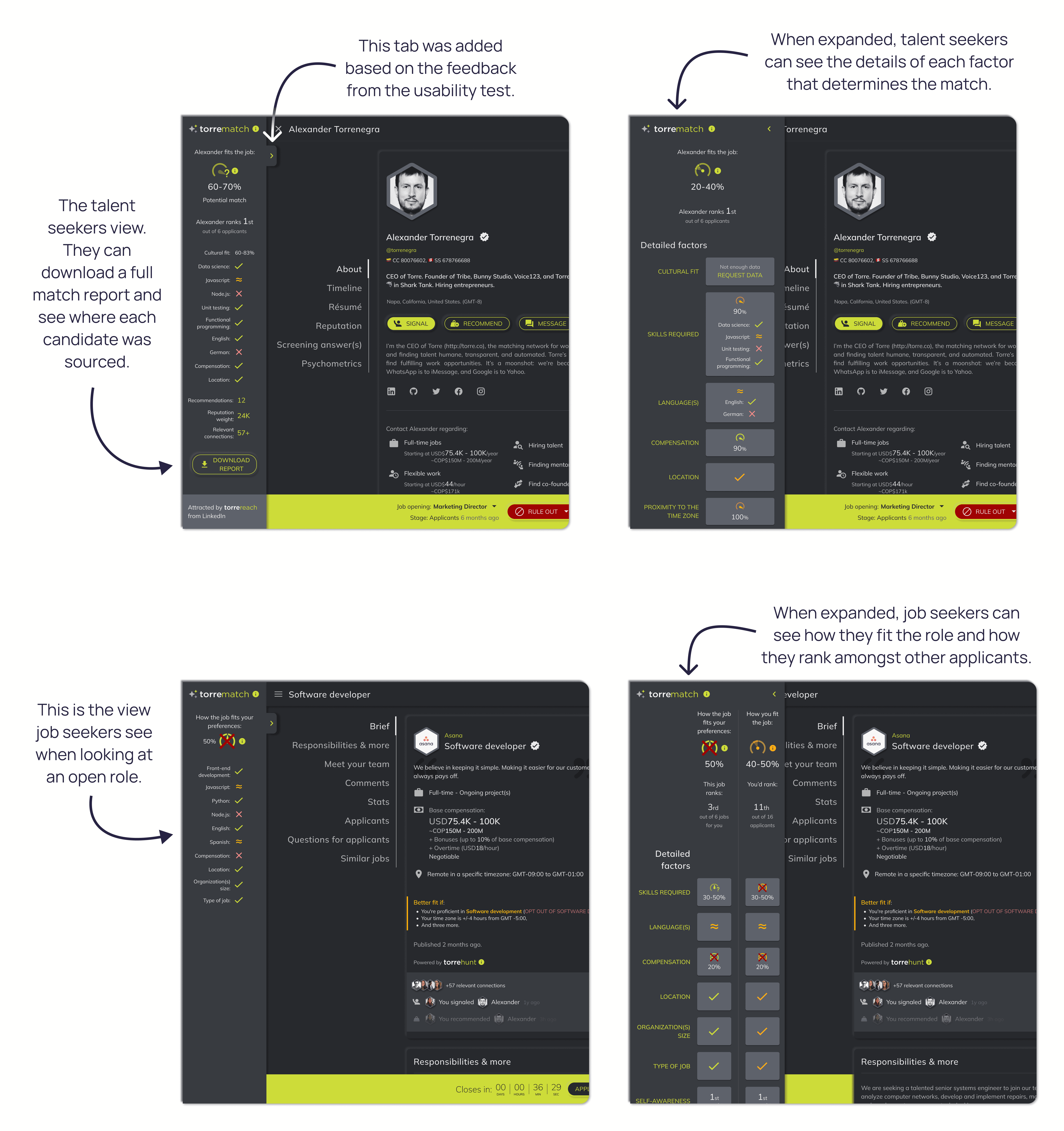
For talent seekers: When reviewing a candidate's profile, it shows how they match the role's requirements and how they rank amongst others.
For candidates: When reviewing a job post, it highlights how the user's preferences and skill align with the job offer and its requirements.
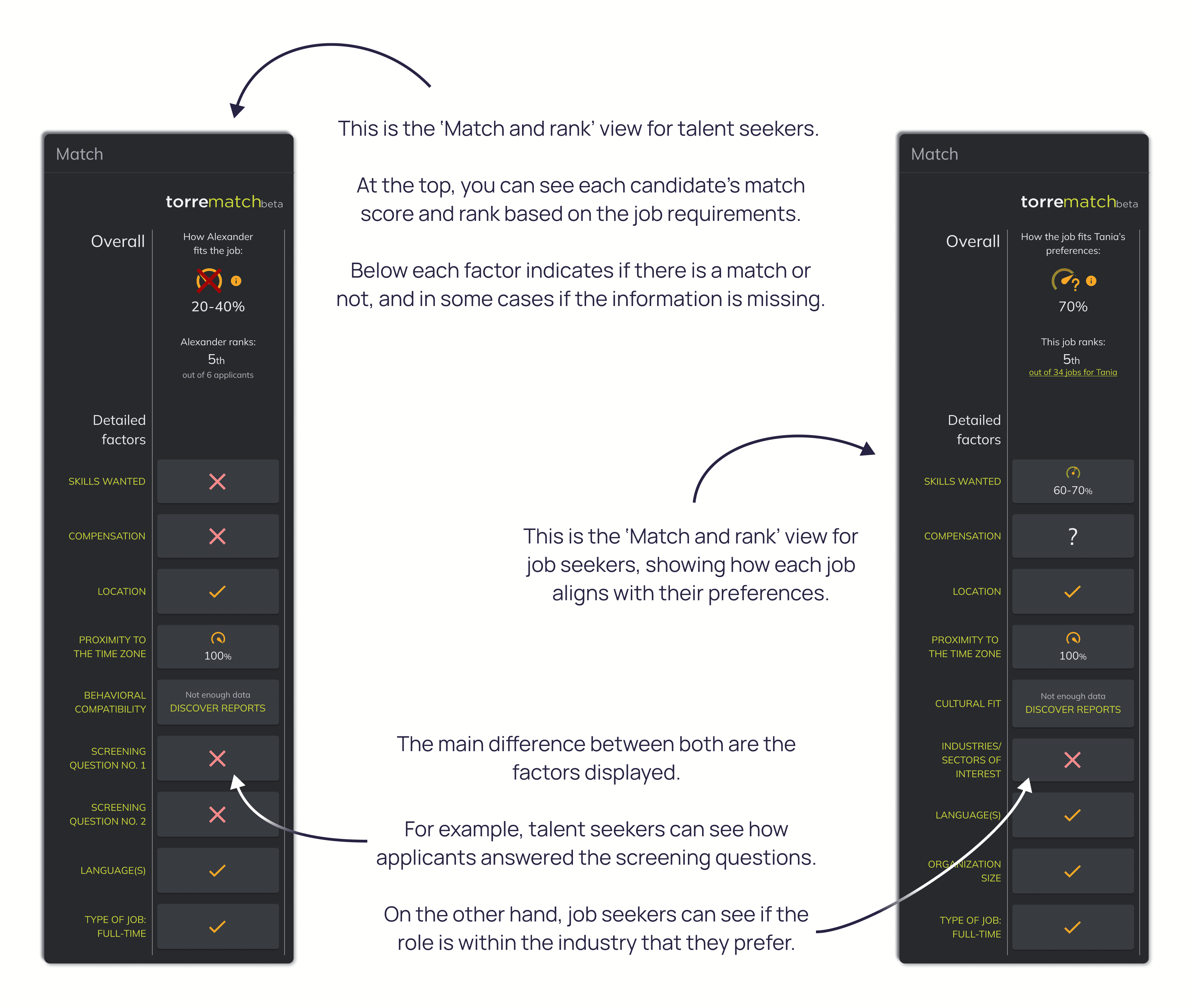
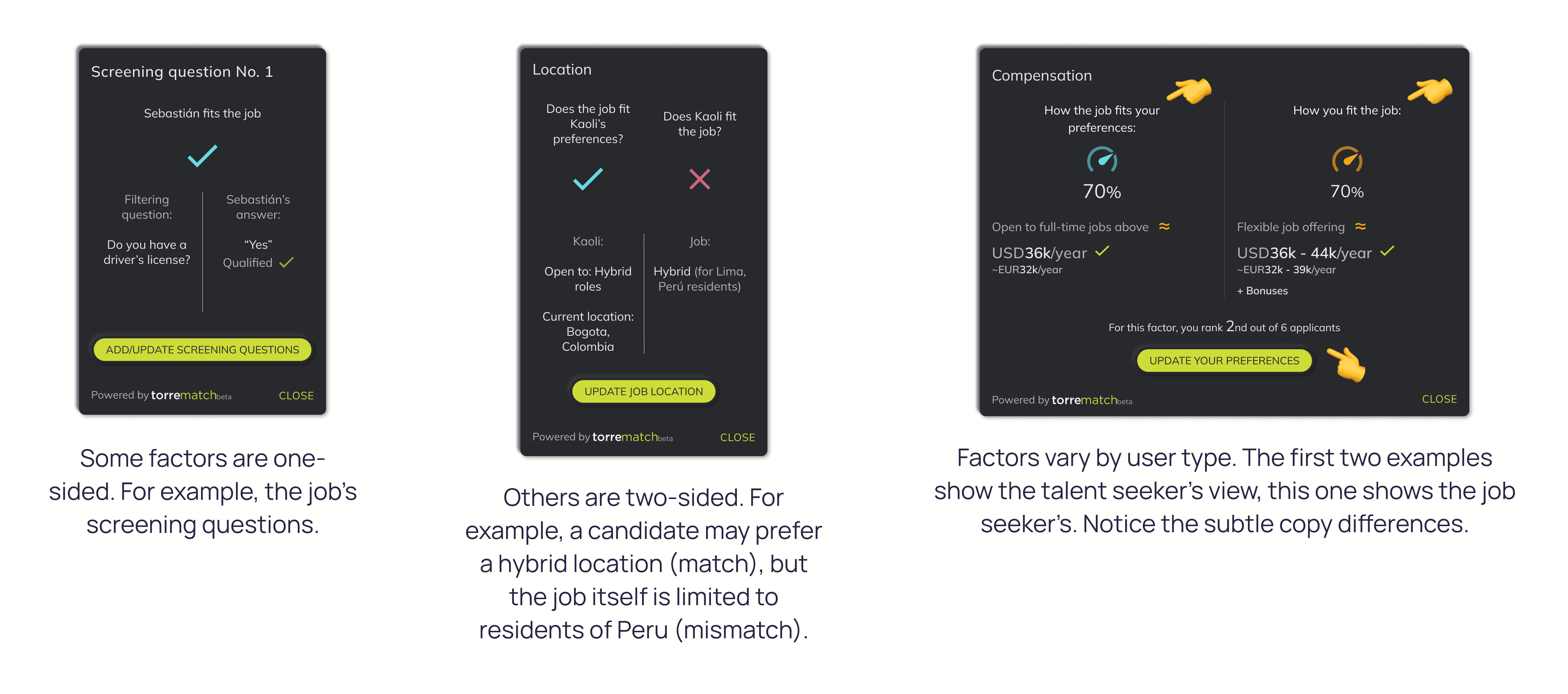
The user can click any factor to open a dialog with detailed information on how the match was calculated. Here are some examples:
Identifying an improvement opportunity
Through the customer service team and previous research done, we gathered some key feedback regarding the 'match and rank' feature:
Retained talent seekers (those who posted a second job) thought the 'match and rank' feature was crucial when evaluating candidates. They rated it highly and saw it as a feature that set Torre apart from other ATS (Applicant Tracking Systems).
New users, both talent seekers and candidates, were often unaware of the 'match and rank' because it wasn’t visible enough. Both the candidate's profile and the job post had too much information that made the feature less relevant.
New users that found the 'match and rank' mentioned that it took them some time to understand how it worked due to the amount of information it displayed.
We concluded that the 'match and rank' was a key asset to retain users, especially talent seekers, the type of users that could be monetized. Our goal was to make the feature more visible and intuitive.
As you can see in this example, in a candidate's profile there are five sections before you reach the 'match and rank' section. There are too many data points, and it isn't clear how the candidate matches in crucial factors such as skills or languages.
From insight to solution
Step 1: Brainstorming
With the Product Manager, we defined what information we were going to show in the 'match and rank' section. The goal was to remove unnecessary data points, leaving only the information that would help users decide if the candidate or the job was a fit.
At the top of the interface we had the match percentage and how the candidate or the job ranked amongst others. Then we agreed on showing other relevant factors such as skills and languages required, as well as compensation and location fit.
Step 2: Defining metrics
Before going into full design mode, again with the Product Manager, we defined the metrics to review the effort's impact.
Our hypothesis was that redesigning the 'match and rank' feature would increase user engagement and help users make faster decisions. So, we aligned with the engineering team on tracking the following metrics:
Engagement with the match-and-rank feature
Number of clicks on the match-and-rank section per visit per view (applicant's profile and job post)
Time from application completed to applicant review
Number of days since an applicant applied until a talent seeker reviews them (matches or rules them out)
Time from applicant acquisition to first job application
Number of days since a new user creates their profile until they apply to their first job
Step 3: Drafting designs and getting inspired by the CEO
I was ready to start drafting some early designs when the CEO surprised me with a hand-drawn sketch of the 'match and rank' for the talent seeker's perspective. It was a very good drawing.
I liked how he'd placed the feature as a sidebar, but I wasn't onboard regarding the amount of information he wanted to show in it. Besides of what we already considered, he included in his draft:
The job opening's name
The candidate's stage in the recruitment process
A button to match or rule out the candidate
The candidate's connections within the platform
The number of recommendations received
A cultural fit summary between the candidate and the hiring team
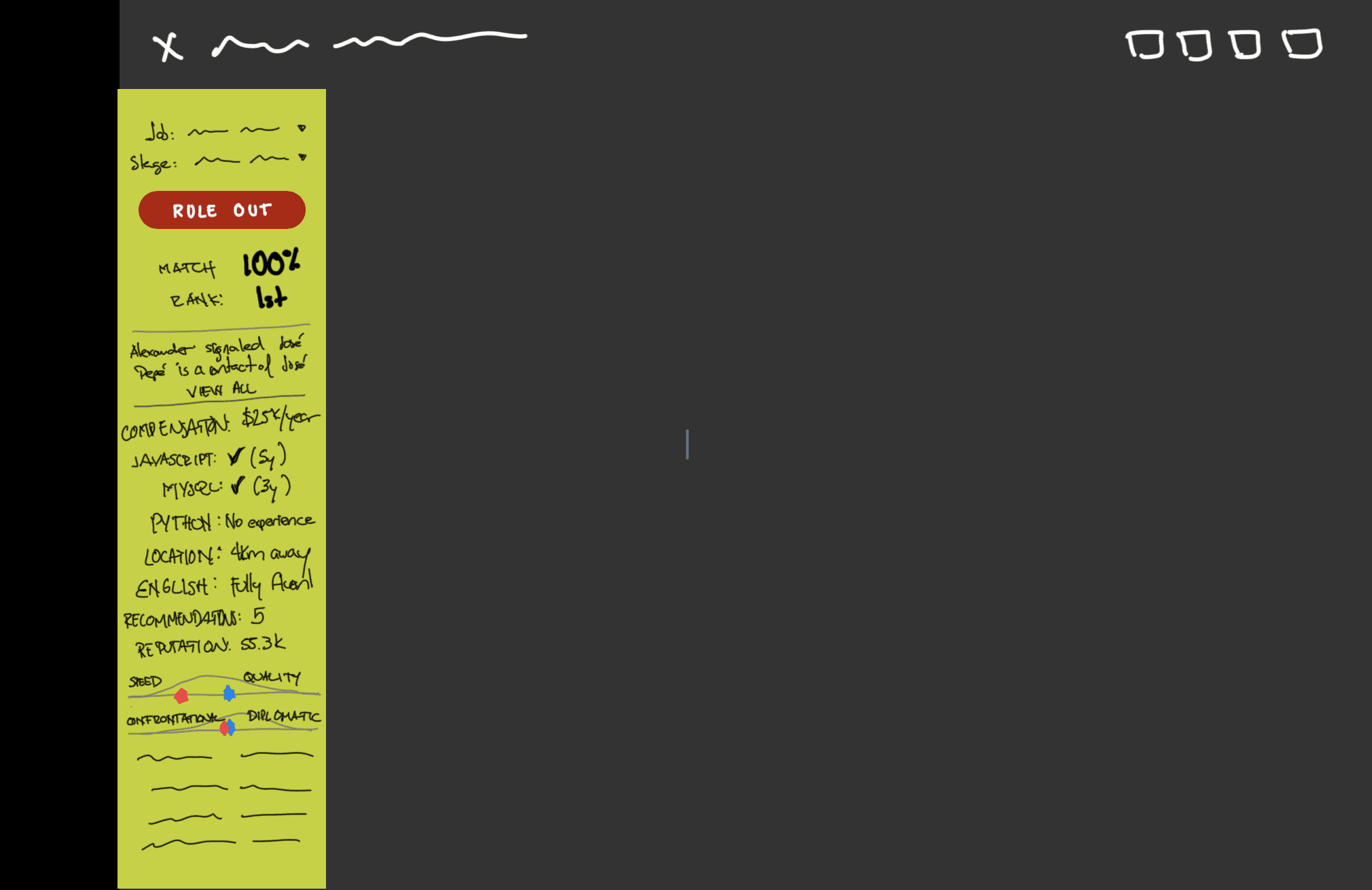
This was the CEO's idea, hand-drawn beautifully on paint 👏
I 'stole' his idea of showing the 'match and rank' as a sidebar because it allowed us to show crucial information immediately without covering other valuable information on the job post or the candidate's profile.
But I really wasn't on board with showing all that information in such a tight space. I felt it would create too much cognitive load and work against our hypothesis of helping users make faster decisions.
With that in mind, I started some rough drafts to explore positioning, color balance, and most importantly, what information was actually relevant to show in the 'match and rank'.
Started with a drawer coming from right to left in a dark tone. When the drawer opened, more factors were rendered. Also, the 'Requirements' section in the job post, would move beneath the 'Brief' section.
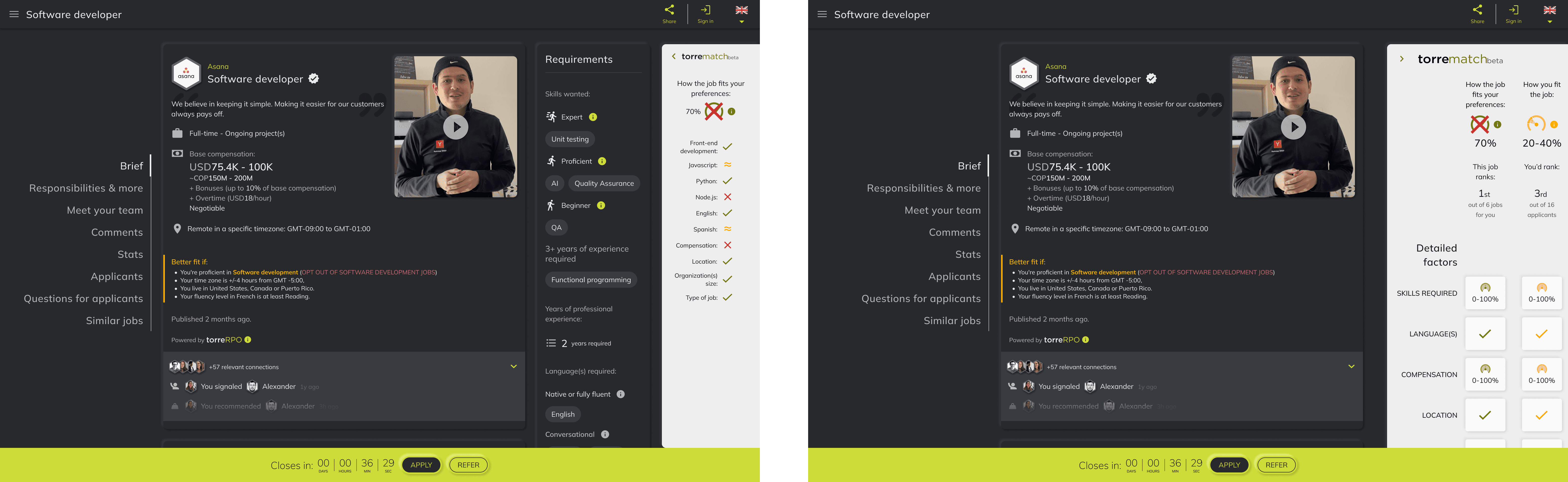
We had recently updated Torre's homepage with a lighter color palette, so I tried with that one too. Honestly, it looked terrible 😂
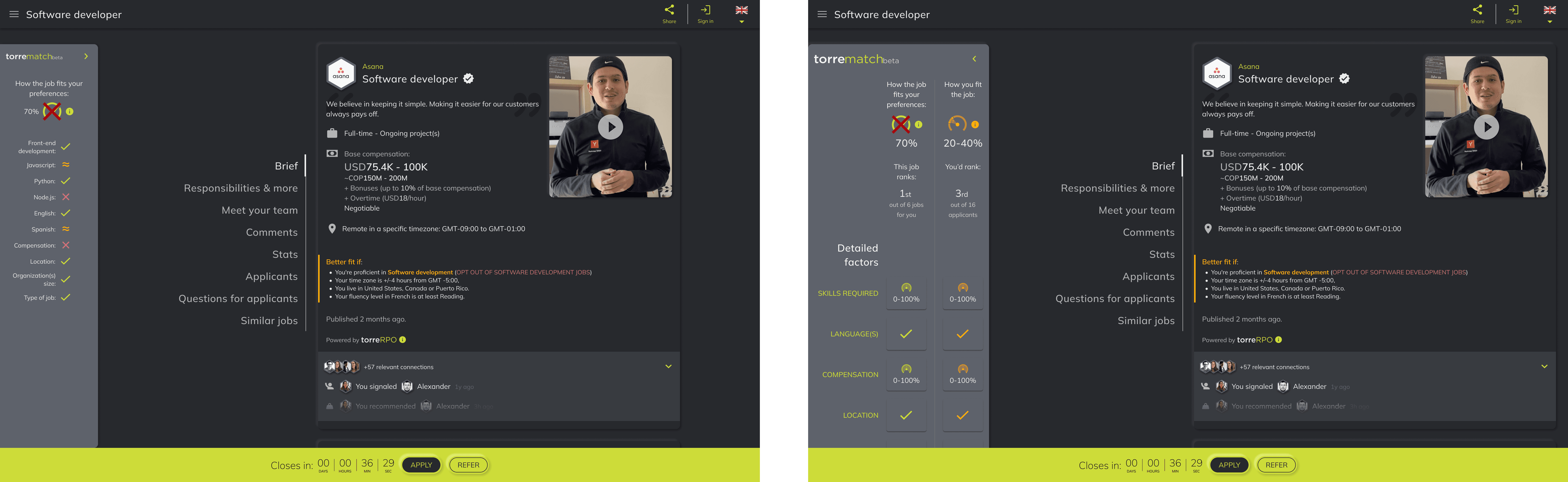
Finally I went back to a darker tone, but switched the drawer to the left side of the screen. This was almost the final version of the design.
I managed to add in the drawer most of the information requested, except for three things: the job opening's name, the applicant's stage in the recruitment process, and a button to match or rule out the candidate.
I presented my final design to the Product Manager and the CEO, and defended my proposal. My arguments were that:
This information was already shown in the bottom bar, it worked on desktop and mobile, and it didn't cover other valuable information in the job post or the candidate's profile.
This information wasn't directly related to how the 'match and rank' calculated the match. Therefore it shouldn't be inside the feature's interface.
Both agreed and I received the sign-off to move forward with usability testing.
Step 4: Prototyping and testing usability
As I've mentioned before, the match-and-rank feature involves two types of users. Therefore I had to create testing guidelines with two different mindsets for the testers:
Testers acting as talent seekers reviewing a candidate's profile
Testers acting as candidates reviewing a job opening
Like in any startup, I was against the clock to deliver results quickly. Since the designs for each type of user were similar, I decided to use a mobile prototype for group and a desktop prototype for the other. This allowed me to deliver results quicker, by working with two groups of testers, instead of four.
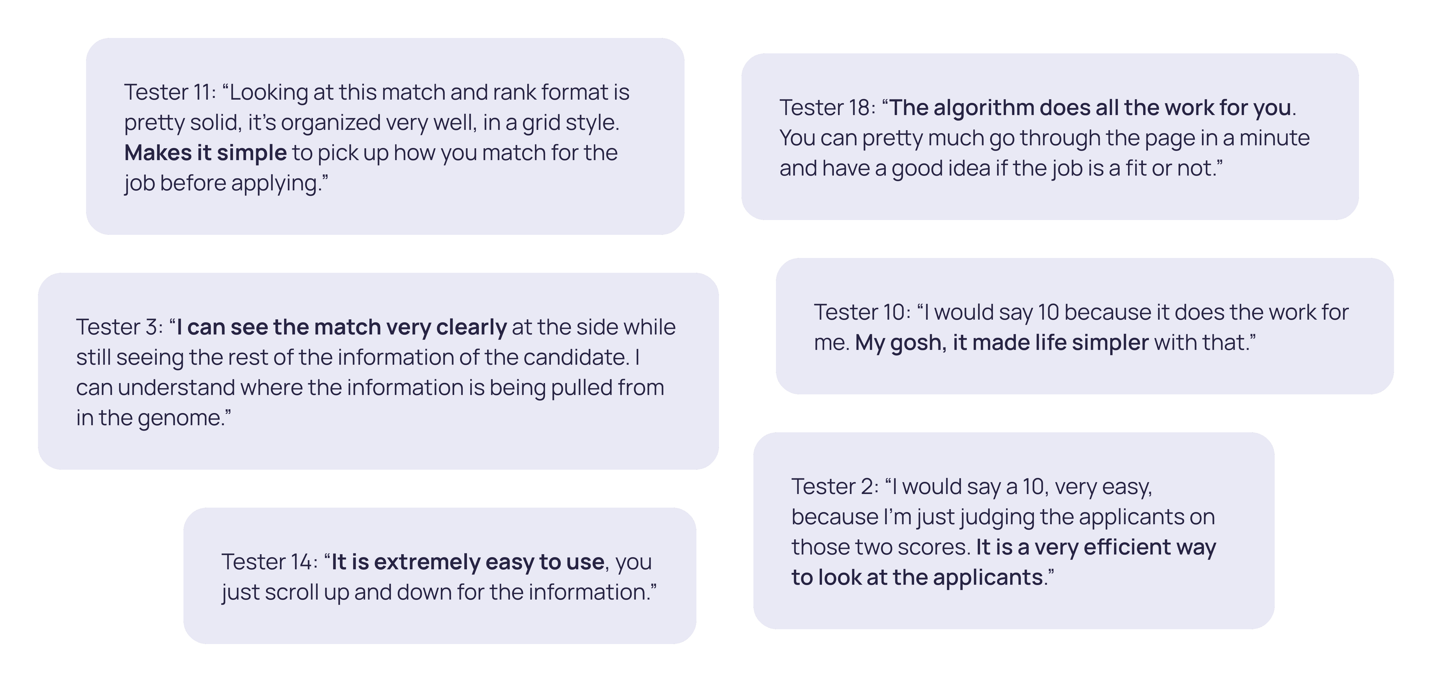
Some of the positive feedback received from the testers.
Key takeaways and learnings
Finally, I collected, analyzed, and presented the test results in a single report. Highlighting the positive feedback received from both types of testers:
Most testers acting as talent seekers found the design efficient, with 8 out of 10 saying it made reviewing candidates easier and quicker.
All testers acting as candidates (10 out of 10) mentioned that the design was easy to navigate. They appreciated how well-organized it was and how quickly it helped them determine if a job was a good fit.
The only issue identified was that some testers, in both groups, were a bit slow when asked to expand the drawer. To address this, I added a tab next to it to make the drawer more noticeable (see the design below).
On the personal side, a couple of learnings stuck with me:
Trust my gut and defend my proposals. I pushed back on adding too much information and the usability test results backed that decision.
Work smart, not hard. By optimizing the guidelines and prototypes to work with two group of testers instead of four, I was able to deliver the usability report on a tight deadline.
Below is the new 'match and rank' design that will be implemented soon at Torre.