User feedback revealed that the match-and-rank feature was highly valued but lacked visibility and was complex to understand.
To address this, I designed a simpler and more visible match-and-rank interface positioned at the top of job posts and candidate profiles, making it easier for talent seekers to assess candidates and for job seekers to evaluate potential jobs.
After a design process that included wireframing, prototyping and testing usability, the design proposal received positive feedback and is set to implemented in the following months.
Torre’s match and rank feature, an AI-powered job-matching system, driven by nine distinct AI models that evaluate more than twenty factors, is one of its most significant value propositions. The match-and-rank view is presented in two sections of the platform:
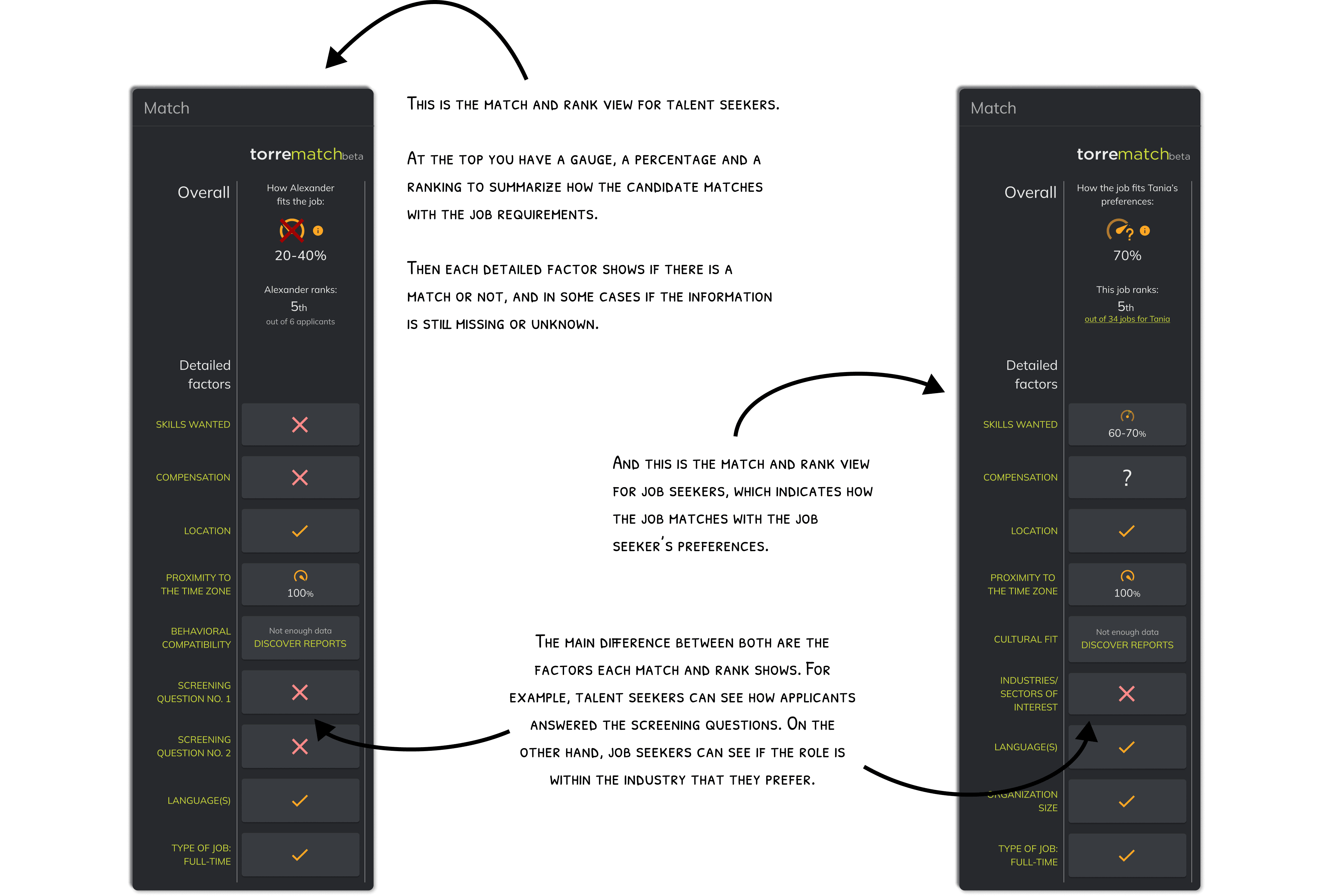
For talent seekers: When reviewing a candidate’s profile, it shows how well the candidate matches and ranks for the role they are looking to fill.
For job seekers: When reviewing a job post, it highlights how their skills and preferences align with the job offer and its requirements.
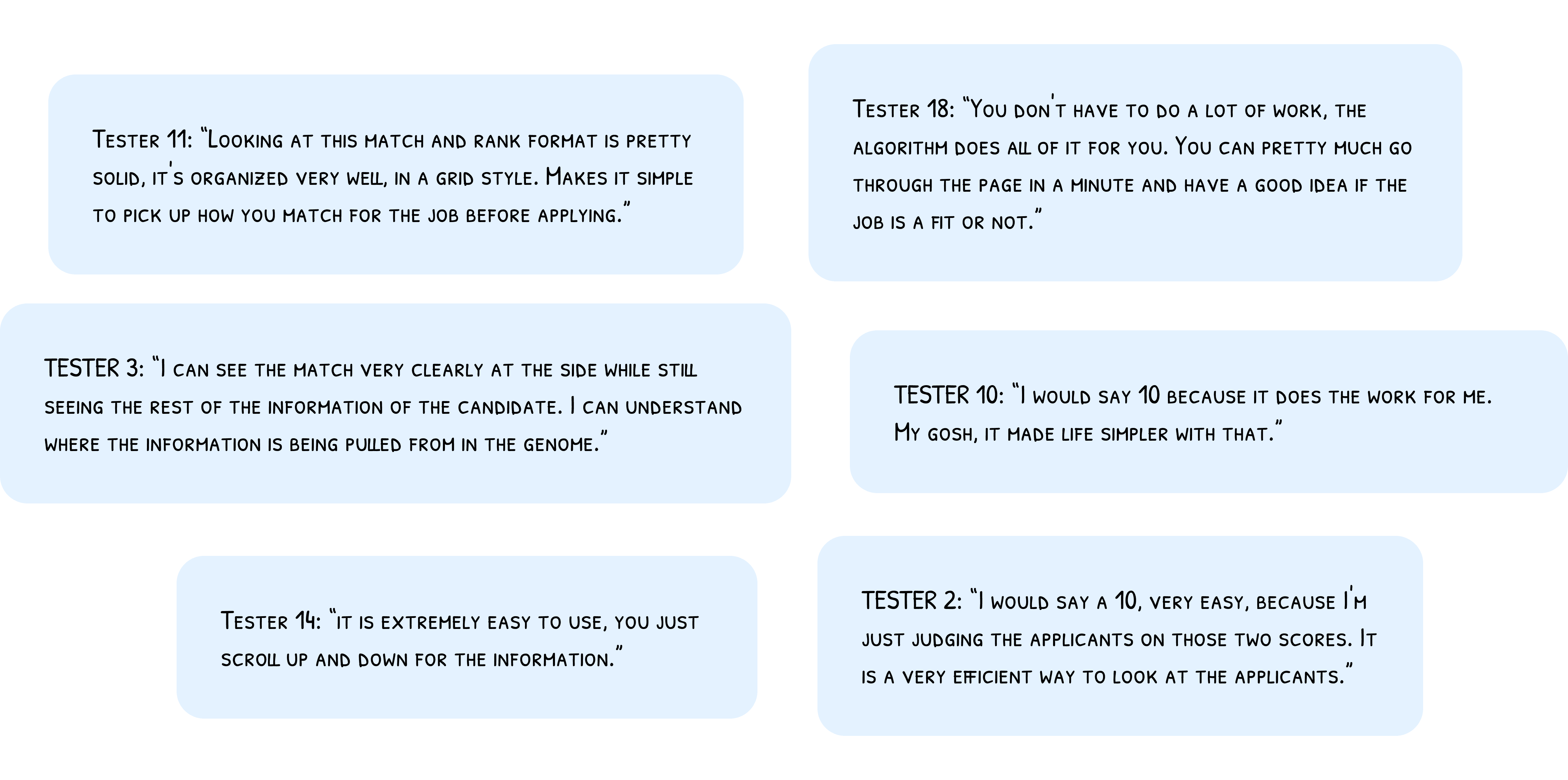
Through the customer service team and previous UX research conducted by the design team, we collected feedback regarding the match-and-rank feature. The most important findings were:
Retained talent seekers had incorporated reviewing the match-and-rank feature into their routine for evaluating candidates. They rated it very highly and believed it was a feature that differentiated Torre from other ATS (Applicant Tracking Systems).
Most newly acquired users (both talent seekers and job seekers) were unaware of the match-and-rank feature because it wasn’t visible enough in the views where it appeared. Both the candidate profile and the job post views have several sections displayed before the match-and-rank section.
Newly acquired users (both talent seekers and job seekers) who noticed the match-and-rank feature mentioned that it was difficult to understand due to the amount of data points it included.
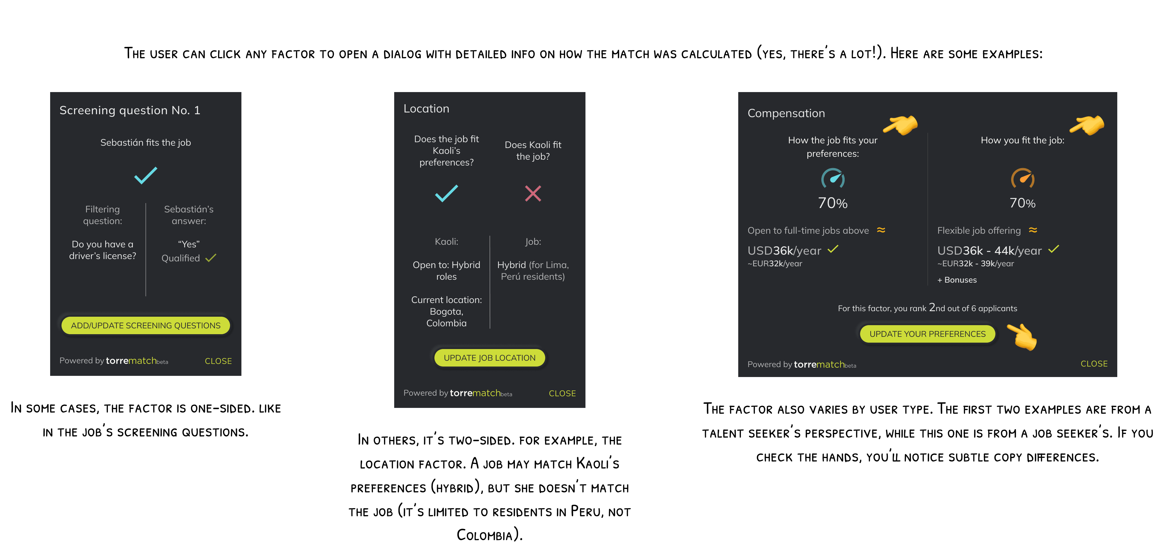
As you can see in this example, there are five sections before you reach the match and rank section. Also, there are several factors to review, and you can't see the details of how the candidate matches in crucial factors such as skills or languages.
Step 1: Ideate
Together with the PM, had to define the crucial information to be shown in the match-and-rank feature. The goal was to remove unnecessary data points, leaving only the information that would help users decide if the job or the candidate was a match or not. Doing this would simplify and speed their decision process.
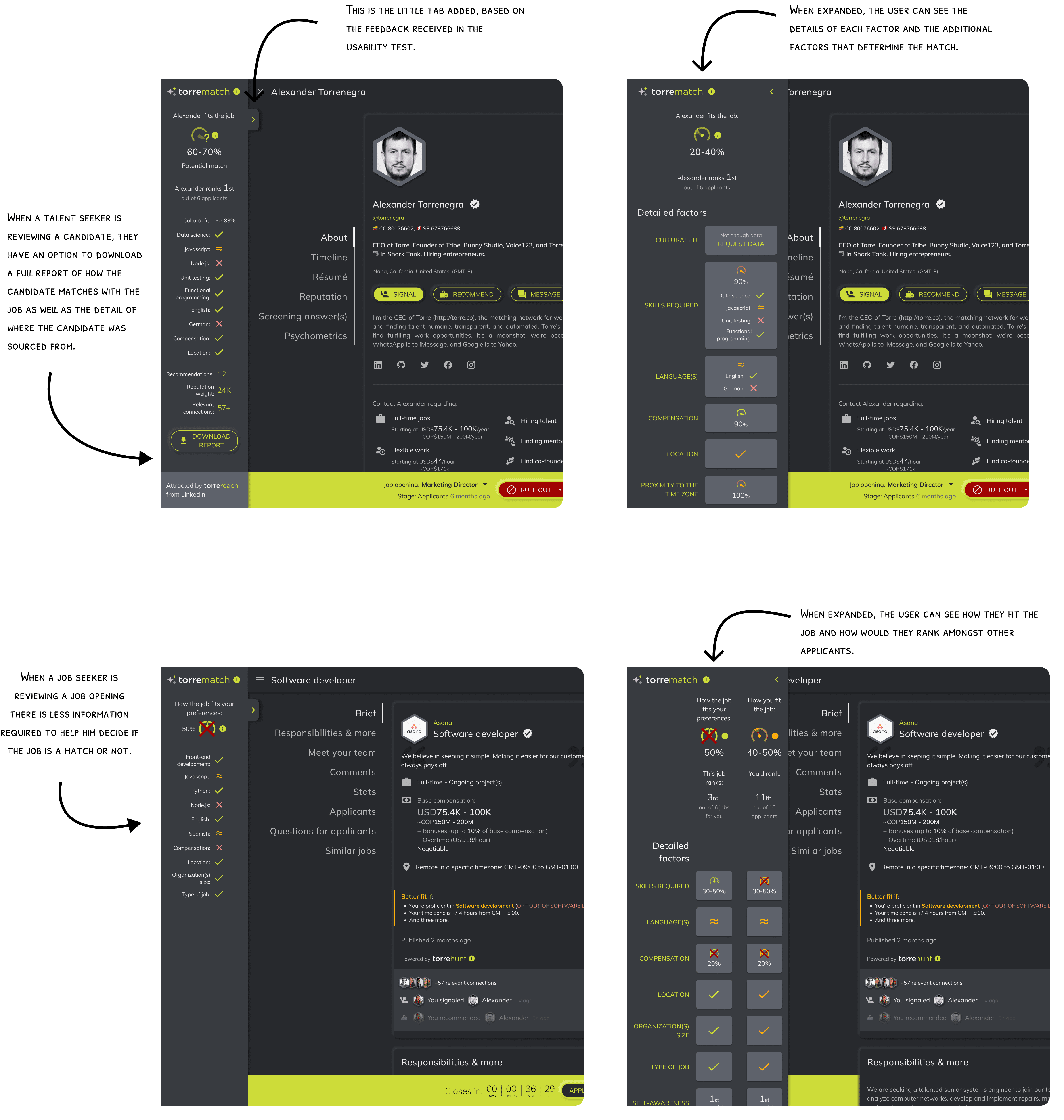
So we agreed on showing the main factors in a summarized view of the match-and-rank, and then allow users to expand it if they wanted to see all of the factors and their details.
The match and rank had more than twenty different factors, but based on the feedback we agreed that the most important were:
To review candidates (4): Skills required, Languages required, Compensation, Location
To review job openings (7): Skills required, Languages required, Compensation, Location, Organization size, and Type of job.
Besides those factors we would only have to add the match percentage and how the candidate or the job ranked amongst others. Sounds simple right? Wait for the plot twist…
Step 2: Define hypothesis and metrics
Our hypothesis with the PM was that redesigning and repositioning the match-and-rank feature would increase user engagement and help users make decisions more quickly. Therefore, we aligned with the engineering team on measuring the following:
Engagement with the match and rank feature
Number of clicks on the match and rank section per visit per view (candidate's profile and job post)
Time from candidate acquisition to their first job application
Number of days since a new user creates their profile until they apply to their first job
Time from candidate application completed to candidate review
Number of days since a candidate applied until a talent seeker reviews them (matches or rules them out)
Step 3: Designing drafts
I was ready to start designing some drafts, but remember the plot twist from step 1? Here it comes.
Our CEO requested that in the candidate's profile, besides the factors, we should also show:
The candidate's ranking amongst other candidates
The candidate's connections within the platform
The number of recommendations the candidate had received
The candidate's reputation weight (related to recommendations)
A cultural fit summary
The job opening name, the candidate's stage in the recruitment process and a button to match or rule out the candidate.
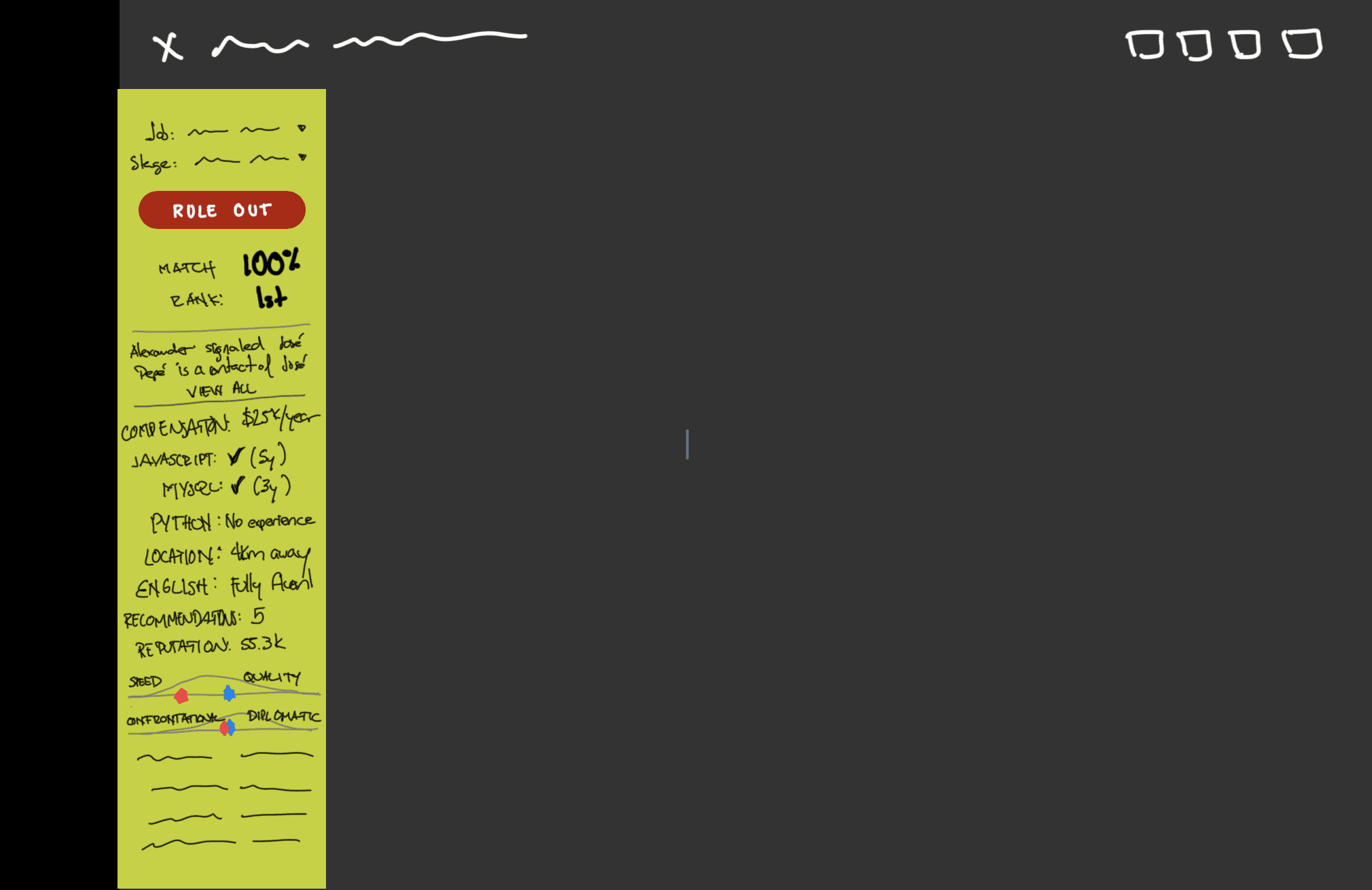
This was the CEO's idea, hand-drawn beautifully on paint.
I liked the idea of showing the match-and-rank as a sidebar because it showed crucial information right away without covering other valuable information users needed to review. But I didn't agree on showing so many things in such a small space. I felt it would lead to a big cognitive load for users, and go against part of our hypothesis 'help users make decisions more quickly'.
So with that in mind I started doing some rough drafts to find the correct positioning, color mix, and relevant information to be shown.
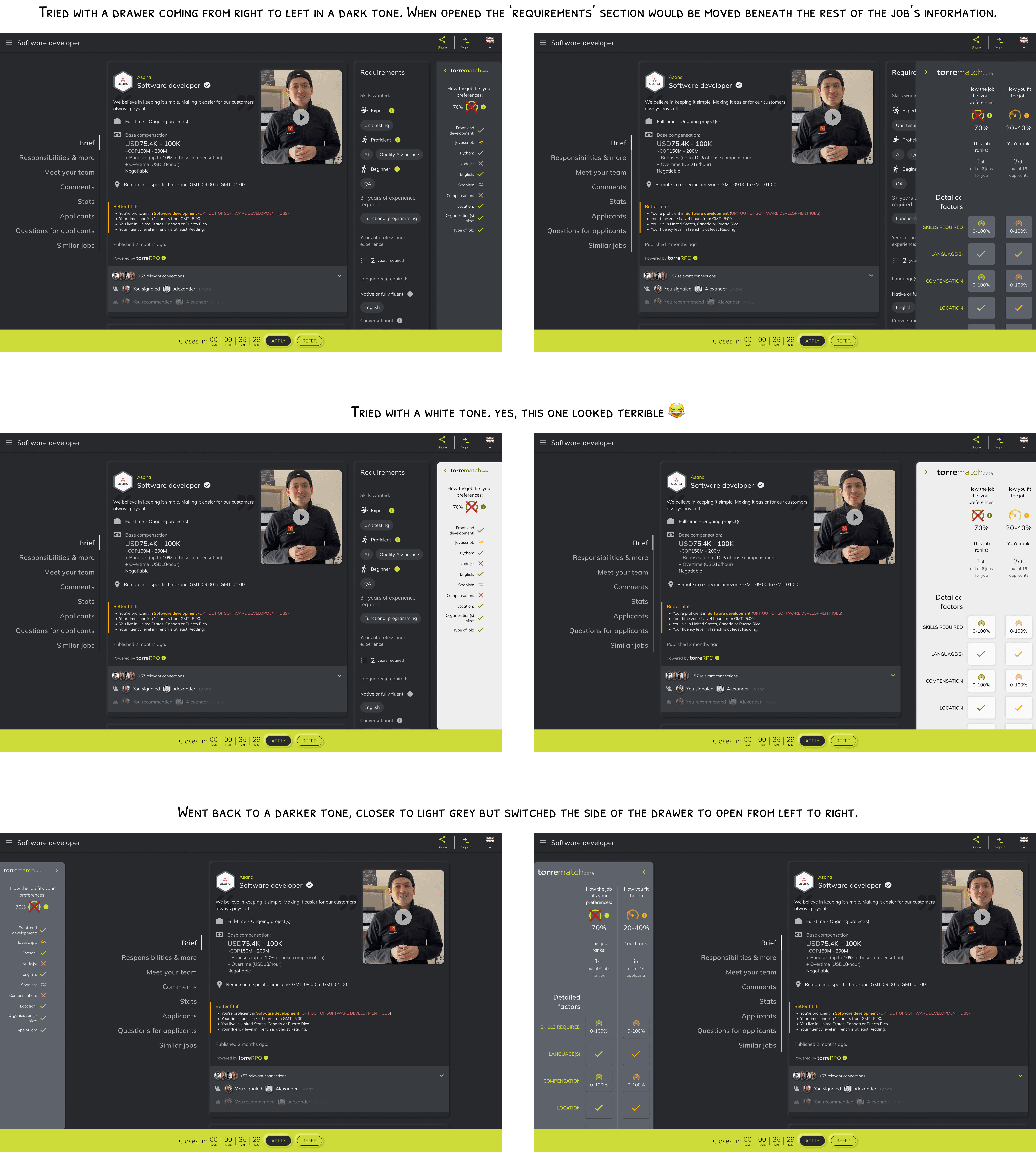
I managed to add all the points requested by the CEO, except the last one: job opening name, candidate stage, and actionable button. I had two arguments for that:
This information is already shown in the bottom bar, it works on desktop and mobile, and it doesn't take up a lot of space or covers valuable information in the candidate's profile or job opening.
This information isn't totally related to the match-and-rank feature, because it doesn't affect how the match is calculated. It can be nice to have it in the same view, yes, but it isn't required.
So after reviewing the design proposals to find the correct positioning and color mix, I received the sign-off from both the PM and the CEO.
Step 4: Prototyping and testing usability
I moved forward to test the usability of the signed-off design with two mindsets for the testers.
Testers acting as talent seekers reviewing a candidate’s profile.
Testers acting as job seekers reviewing a job opening.
Since the views were similar, I optimized testing by using a mobile design prototype for one guideline and a desktop design prototype for the other. This allowed me to test both screen sizes efficiently with only two flows instead of four.
With the guidelines and prototypes ready, I used UserBob to recruit participants to test the prototypes.
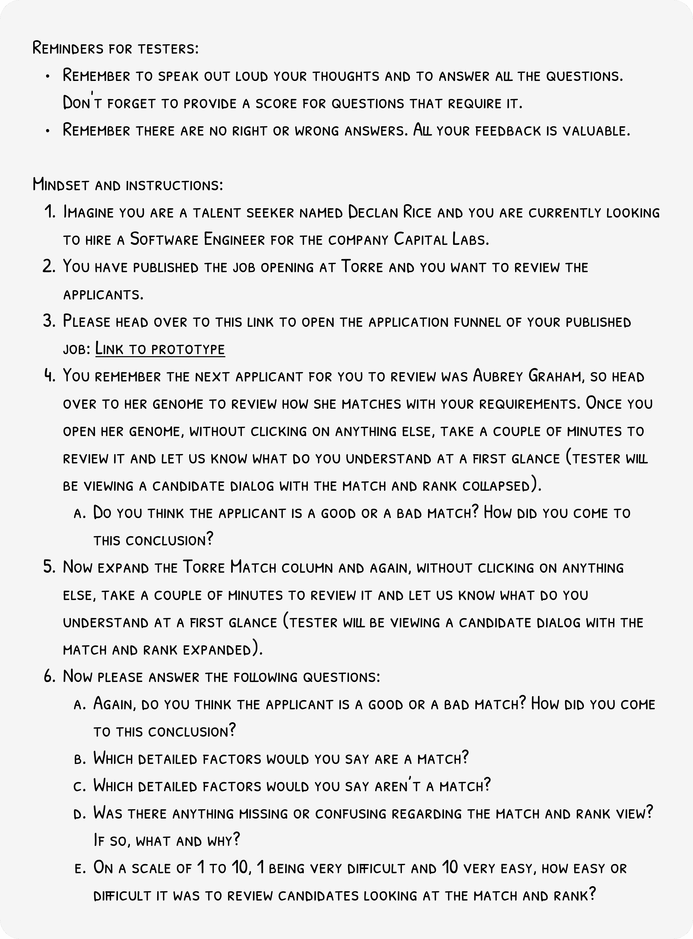
The 'Users acting as talent seekers reviewing a candidate's profile' guideline